1. Graphical User Interface Inspired by the work of Vannevar Bush and Ivan Sutherland, Engelbart’s oNLine System (NLS) was the first implementation of a GUI, a virtual desktop incorporating windows, menus, icons, and folders. For an industry used to dealing with punch cards and command lines, this was radical thinking. While most computer scientists were focusing on making computers smarter, Engelbart was interested in how computers could make humans smarter.
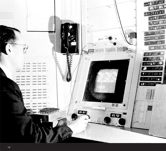
Several of Engelbart’s team went on to develop the groundbreakingXerox Alto. However, it would not be Xerox that steered the course of modern computing. After a visit to Xerox PARC, the research centre established to design the future of computing, Steve Jobs saw the GUI first hand. In 1983, Apple released the Lisa, the first home computer with a GUI and mouse. Much to Apple’s irritation, Microsoft quickly followed suit, releasing Windows 1.0 the same year. Steve Jobs accused Bill Gates of plagiarism, Gates countered, “Well, Steve, I think it’s more like we both had this rich neighbor named Xerox and I broke into his house to steal the TV set, to find out that you had already stolen it.”
America Online knew a good idea when they saw one and adopted the GUI in 1989, opening up the Internet beyond the technical community. History repeated itself with the web. It was when Mosaic released the first point-and-click browser that the web started to appeal to a wider audience.That was 1993.
Mosaic evolved into Netscape Navigator, launching with the slogan “The Web is for everyone.” Microsoft realized this was true and released its Internet Explorer browser, copying most of Netscape’s functionality. Twenty years on, Internet Explorer, Firefox, Safari and most browsers since remain remarkably similar to Netscape’s original model. Some see this as a missed opportunity; others see it as testament to Engelbart’s thinking 25 years earlier. What everyone agrees on is that without the GUI, the web would not be the global phenomenon it is today.
2. The Emoticon In 1963 State Mutual Life hired cartoonist Harvey Ball to create a smiley face for the company’s “Friendship” campaign. He designed a circular yellow face with two black dots for eyes and a simple curve for a mouth. It took him 10 minutes and he was paid $45. In 1970, brothers Bernard and Murray Spain added the line “Have a Nice Day” and sold millions of dollars worth of merchandise. Two years later, Franklin Loufrani gave the face a name and took the “Smiley” to Paris, licensing it to French newspapers to highlight positive stories. Harvey Ball’s design had gone global. When asked if he regretted not trademarking his design, Ball’s response was philosophical: “Hey, I can only eat one steak at a time.”
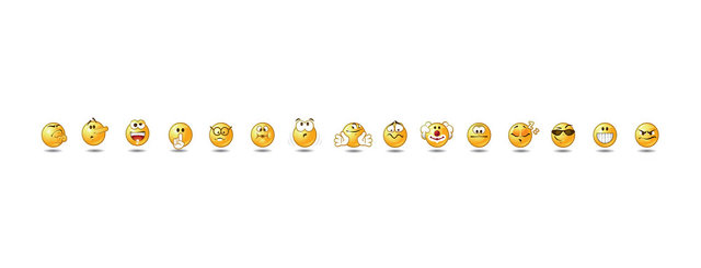
The first use of the smiley face on a screen was in 1982 at Carnegie Mellon University. Jokey remarks on the computer science department’s online bulletin board were often misinterpreted and a flame war would result. At best, the original intent of the thread was lost. At worst, people were offended. Research professor Scott Fahlmanpragmatically suggested it would be a good idea to mark posts that were not to be taken seriously:
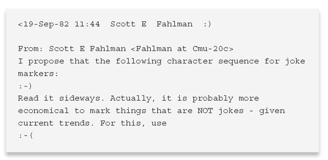
The convention caught on and spread to other universities and research centers. The Smiley and other emoticons, like the wink ;-), grin 😀 and tongue out 😛 were very quickly in common use on bulletin boards across the Internet.
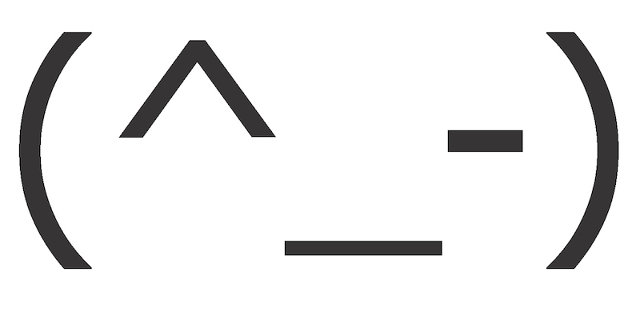
In the mid-’80s, Japanese internet users popularized a style of emoji that did not involve tilting your head, such as (*_*) and (^.^). Other examples include a wink (^_-) and confusion (@_@), while a stressful situation is represented by (-_-;), the semi-colon representing sweat!
When web chat took off in the mid-’90s, emoticons evolved into images. Instant messaging services such as ICQ and AOL Instant Messenger started offering a wide range of icons that could be inserted into text at the click of a mouse. In 1997, Franklin Loufrani’s son, Nicolas created a dictionary of animated GIF icons, based on the Smiley, to replace text-based emoticons. There are now over 2,000 icons in this dictionary and, to the annoyance of many, modern platforms ofter auto-replace text-based emoticons with these animated images.
Of the phenomenon he created, Scott Fahlman says wearily, “I had no idea that I was starting something that would soon pollute all the world’s communication channels.” I like to think that, in his head at least, this statement ends with a smiley face.
3. Graphics Interchange Format It’s 20 years old. It supports only 256 colors. It’s unsuitable for photographs. It has no sound capability. It’s inferior to the PNG (see below). Yet the GIF is still hanging in there. Why has it proved so tenacious? Because it can move.
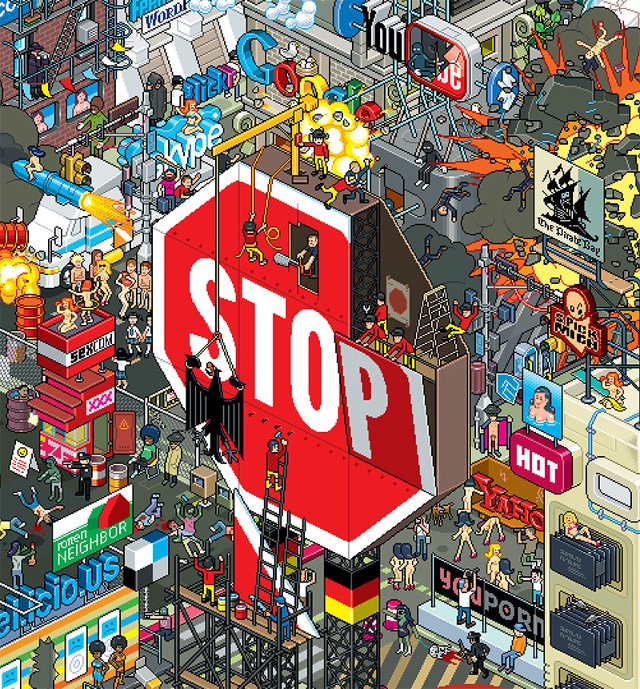
CompuServe introduced the GIF format in the pre-web days of 1987. It was released as a free and open specification for sharing colour images across their network.
A GIF supports 8 bits per pixel. This allows it to reference 256 distinct colors, chosen from a palette of millions. Each of these colors is stored in a table and given a value. When neighboring pixels are the same color, the run-length is specified followed by the color value. This is called LZW data compression, after its creators Abraham Lempel, Jacob Ziv, and Terry Welch. It means images can be downloaded reasonably quickly, even with slow modems.
LZW compression was described by Welch in the June 1984 issue of theInstitute of Electrical and Electronics Engineers (IEEE) magazine. It soon became the most popular form of data compression. What the article did not mention was that Unisys help a patent on the algorithm.
GIFs really took off in 1993 with the release of Mosaic, the first graphical browser. Mosaic introduced the tag, which supported two formats–GIF and a black-and-white format called XBM. Mosaic became Netscape and, as it grew, the GIF grew with it.
In 1994, Unisys decided to enforce its patent, announcing that developers would have to pay a license fee to use their algorithm. This caused outrage. It turned out that the patent covered the software that made GIFs, not the files themselves, but it was close enough for a working group to come up with a new format, portable network graphics (PNG). The PNG was adopted by the World Wide Web Consortium (W3C) as a standard. The GIF looked doomed.
In 1996, Netscape 2.0 was released. It supported GIF animations–multiple frames shown in succession. The web went crazy. Suddenly there were spinning logos, animated under-construction signs, and dancing babies everywhere you looked. The PNG does not supportanimation.
The LZW patents expired in 2004. Since then, Myspace and Tumblr have attracted a new generation of GIF artists. It is the limitations of the GIF that have made it so attractive. Within minutes, a GIF animation can be made and viewed, often without the need to click on a link. Sometimes the old ways are the best ways.
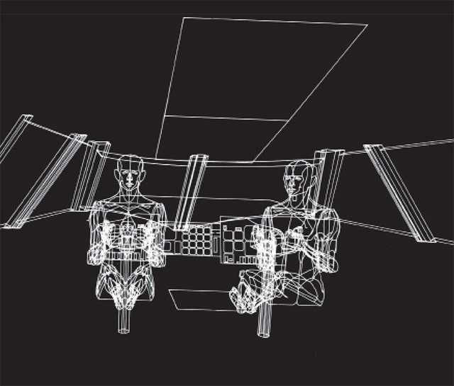
4. User-Centered Design The father of user-centered design is arguably William Fetter, an American designer who worked for Boeing. In 1960 he coined the term Computer Graphics. In 1964, he made the first computer model of a human body. Known as “Boeing Man,” this wireframe pilot was used to design a virtual cockpit ergonomically, optimizing his ability to reach the instruments. The manufacturing and design industries have put people at the center of design ever since.
When the webpage emerged, design was not a factor. It was a simple text document with embedded hyperlinks. The only design consideration was font size. Spoiled by a decade of desktop publishing, graphic designers shunned the limited possibilities of HTML. Engineers and computer programmers controlled the space. Webpages were information-led. Form was functional. As the web developed into a graphical environment, layout became an issue.
By the late ’90s it was chaos. Images, animated GIFs, Flash and Javaapplets competed for space within frames and tables. This new media was crying out for new rules. Step forward Jakob Nielsen, engineer and usability expert at Sun Microsystems.
In 1995, Nielsen launched his website useit.com. While his views were controversial, especially among web designers trying to push back the boundaries of HTML, his ideas were a beacon in the emerging field of web usability. He advocated user testing and paper prototypes that put the user’s expectations at the center of the design process. He was a champion of minimal designs that spoke the language of the user. This meant following real-world conventions and avoiding system-oriented terminology and functionality. Don Norman, Jakob Nielsen’s business partner, describes it well: “We must design our technologies for the way people actually behave, not the way we would like them to.”
Steve Krug’s ideas on usabilty are less contentious. His seminal book from 2000 says everything you need to know about user-centered design: Don’t Make Me Think.
5. Net Art In 1952, computer scientist Christopher Strachey developed a program for the Manchester Mark 1 computer that created randomized love letters. It was the first example of computer art.
With Strachey’s generative love letters, the result is secondary to the process. This typifies computer art and the Net Art movement that followed. Unexpected outcomes are welcome, opening doors rather than closing them. Even the way the genre got its name was serendipitous: ASCII artist Vuk Cosic received a corrupted email in 1995; the only words he could make out were “Net Art.”
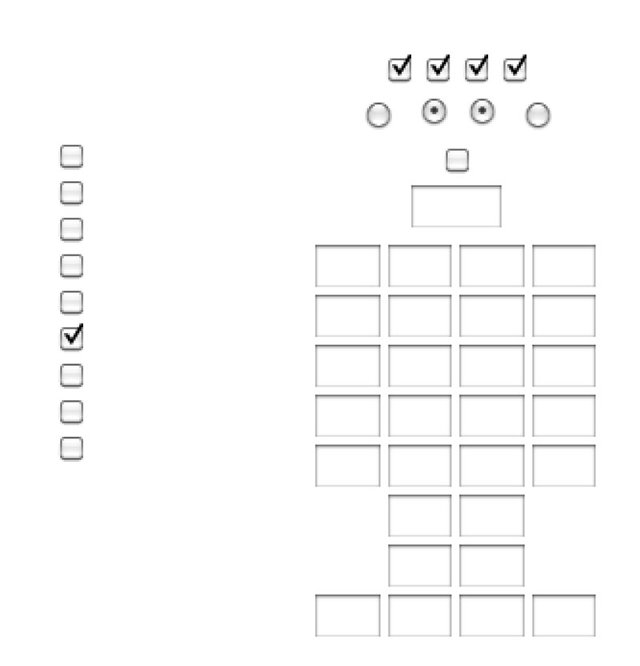
Born in Belgrade, Cosic emigrated to Slovenia in the early ’90s. While U.S. dotcom companies seized on the commercial potential of the Web, Eastern Europe was critical to its artistic development. The break-up of the Soviet Union created an optimistic, open atmosphere, exemplified by the web. Russian artists Olia Lialina and Alexei Shulgin were hugely influential. Lialina’s My Boyfriend Came Back From The War, from 1996, is a hypertext narrative, as envisioned by the godfather of hypertext, Vannevar Bush, at the end of World War II. Shulgin’s Form Art manipulates HTML’s layout capabilities, using checkboxes, radio buttons and text fields to create forms. The appearance varies from browser to browser, evolving with every release, as if it were alive.
Many of the early online art projects addressed technology as the subject matter, as well as the medium. Heath Bunting’s King’s Cross Phone-In (1994) demonstrated the power of network technology. Bunting listed the telephone numbers of the public phones at London’s King’s Cross station on his website and encouraged visitors to call the numbers at a certain time, or to show up and speak to a stranger. In 1995, Jan Heemskerk and Dirk Paesmans, known as Jodi, created wwwwwwwww.jodi.org, a website highlighting the hidden depths of the web. The site appears to be indecipherable–only when the visitor views the source code can they see the true message. The HTML takes the form of an atomic bomb.
Another recurring theme in Net Art is the commercialization of the web. Webby Award-winner and “the first Internet application designed by artists,” the Web Stalker is an experimental browser. Developed by British Web Art activists I/O/D in 1997, the browser strips out the superfluous, so only the raw text, links and metadata remain.
The web gave artists who operated outside the traditional art world access to a global audience. Free from the commercial world of galleries and art-world institutions, Net Art was a reaction against the cultural elite, its lack of marketability making it all the more authentic.
Artists and designers like Aram Bartoll, Aaron Koblin and Rafael Rozendaal continue the spirit of Net Art, but things have changed. Net Art is no longer about the huge impact of the Internet on culture. We are all Net Artists now.
6. Scaleable Vector Graphics In January 1993, Jonathan Gay, Charlie Jackson, and Michelle Welsh founded FutureWave Software. Their vision was to create a software application that allowed people to bypass the mouse and draw directly on a computer screen. They called it SmartSketch, but just as it was about to launch, AT&T scrapped PenPoint, the operating system it was built on. FutureWave had no choice but to adapt its software to the keyboard and mouse. From having a market to itself, it was suddenly competing with Adobe Illustrator and Macromedia FreeHand. SmartSketch had become a “me too” product.

With the crazy idea that it might be possible to put animations on the web, Gay and his programming sidekick, Robert Tatsumi, started to focus on SmartSketch’s animation capabilities. In 1994, the only way to do this was through Java. The results were painfully slow, but they stuck with it. The breakthrough came the following year, with the release of Netscape Navigator 2.0. This second version of the Netscape browser added a whole load of features, including Netscape Mail, JavaScript, support for animated GIFs and crucially, an API (application programming interface) for plug-ins. The ability to extend the browser via a plug-in meant that SmartSketch animations could be as fluid online as they were offline. SmartSketch was renamed FutureSplash Animator and eventually shipped in May 1996.
FutureSplash immediately caught the attention of Microsoft, which was playing catch-up with Netscape and throwing everything at it, including relaunching MSN as a web TV network. Internet Explorer 3.0, released in August 1996, shipped with the FutureSplash plug-in, and suddenly it was mass market. Disney Online quickly became a client and then Fox launched the Simpsons website using FutureSplash. The six-person FutureWave team was hot property. By the end of the year, FutureSplash had been purchased by Macromedia and renamed Macromedia Flash. The Design Director at Macromedia was musician David Hillman Curtis, the nephew of Chris Hillman of The Byrds. Hillman Curtis redeveloped the Macromedia website using the newly acquired software and, in doing so, created the first Flash website. A wave of non-programmers followed in his creative footsteps.
The release of Macromedia Flash was a tipping point. It opened up the web to animators and illustrators in the same way as the Mosaic browser had done for the very first web designers four years earlier. Brands could at last see the potential of this new media, which attracted serious investment, prompting the dotcom gold rush.
Sure, there were some dodgy moments along the way, but by and large Flash has made the Web a more interesting place.
7. Infographics The web has given us access to more information than ever before. This volume of data demands new ways of navigating it. David McCandless, author of Information Is Beautiful, says that “by visualizing information, we turn it into a landscape that you can explore with your eyes, a sort of information map. When you’re lost in information, an information map is kind of useful.”
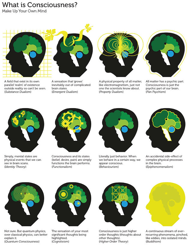
Providing information visually is not new. Human beings have been using marks, painting images and drawing maps for thousands of years. However, true information graphics are less than 100 years old. It was in 1925, at the Social and Economic Museum of Vienna, that Otta Neurath invented information graphics as we recognize them today.
Neurath’s vision was to bring “dead statistics” to life by making them visually attractive. His maxim was: “To remember simplified pictures is better than to forget accurate figures.” Originally called the Vienna Method, and later ISOTYPE (International System of Typographic Picture Education), the graphic language he pioneered is now ubiquitous, appearing everywhere, from airports to websites.
While Neurath gave us the pictogram, the statistician Edward Tufte is the pioneer of data visualization. His Data Density principle suggests that the more data is depicted, the better. In order to simplify a chart, reduce its scale rather than reduce the data. Counterintuitively, shrinking most graphs improves legibility. The Data-Ink Ratio recommends that the ink used to represent data should be greater than the ink used to show non-data. Chartjunk, the unnecessary use of graphical effects, should be omitted entirely. The Lie Factor assesses the graphical integrity of the chart; the size of effect shown in the graphic should reflect the size of effect shown in the data.
The rise of the social web and our reluctance to read long documents has propelled the work of information designers like Neurath, Tufte, and McCandless to the fore. It is boom time for infographics. Alongside other bite-sized, sharable content such as photos of kittens and GIF animations, infographics have become a staple part of our media diet.
Occurring at the intersection of art and science, infographics appeal to both creative and analytical thinkers. Done badly, you get Chartjunk. Done well, they make data meaningful and entertaining. Sometimes even beautiful.
8. Embeddable Fonts The first generation of web browsers, such as Mosaic and Netscape Navigator, displayed set fonts. In 1995, Netscape introduced the tag, allowing web developers to choose their own fonts. Technically, you could specify any font you wanted for your site; in practice, users had to have that font installed on their computer to view it.

The set of fonts guaranteed to be pre-installed on both Windows PCs and Aplle computers became known as web-safe fonts. These included Georgia and Verdana, the first fonts designed for the screen, and staples such as Arial, Courier, and Times. The number of web-safe fonts grew, but almost 20 years later, web designers were still limited to just a handful.
Workarounds, such as Scalable Inman Flash Replacement (sIFR), enabled the replacement of text with Flash-based fonts. However, these increased page-loading times and were not universally accessible, so were not widely used.
In 2009, most browsers began supporting the @font-face command, which allowed a webpage to link to a font file. Web designers celebrated. Once more, in theory, they could use any font they wished. Once more, in practice, this was not the case. Most font foundries did not allow their fonts to be freely downloaded.
A company called TypeKit saw an opportunity. It licensed thousands of fonts on a web-only basis and offered a linking license to subscribers. Its platform serves fonts quickly and consistently, dealing with the differences in how browsers handle font files. Similar services, such as Google Web Fonts, Font Squirrel, and Fontdeck have now emerged. Web designers’ dream had come true–they could at last use any font they wish. Just make sure it’s not Comic Sans.
9. Responsive Web Design Whether we are consuming media on a PC, a tablet device, asmartphone or the TV, we like content optimized for that particular device. This is not easy when they all have different screen sizes and interfaces and are used at different points of the day for different tasks.
Websites are traditionally optimized for desktop browsers, but increasingly the most important screen is the one on our phone. It is the last screen we look at at night. It’s the one screen that cuts across our work and leisure time. Content optimized for larger screens often results in a disappointing experience on smaller screens. Cropped images, wrapped navigation, rollovers no longer working and illegible text are all common degradations. Designing for a smaller screen is equally unsatisfactory at larger resolutions. Traditionally, this has meant different layouts for each device, but with ever more screen sizes to optimize for, this is a huge task.
In a May 2010 article for A List Apart, Ethan Marcotte suggested a solution. Inspired by responsive architecture, where buildings react and adapt as people pass through them, he coined the term “responsive web design” (RWD). In the article he states: “Rather than tailoring disconnected designs to each of an ever-increasing number of web devices, we can treat them as facets of the same experience. We can design for an optimal viewing experience, but embed standards-based technologies into our designs to make them not only more flexible, but more adaptive to the media that renders them. In short, we need to practice Responsive Web Design.”
Responsive web design makes no assumptions about a browser window’s width. It responds elegantly to the device using media queries, a World Wide Web Consortium standard. Navigation can be adjusted, images can be repositioned, content can be re-aligned and font sizes adjusted. It is a better experience for both the user and the developer.
Despite the hype, responsive design is just good design. Since the birth of the web, designers have had to create webpages that worked at multiple resolutions. Screen resolutions have always varied. Just like users, they come in all shapes and sizes. It is the designer’s job to accommodate them.
Curated by Jim Boulton.