Crime 1: Form labels that aren’t associated to form input fields
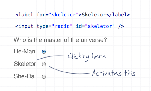
Using the ‘for’ attribute allows the user to click the label to select the appropriate input fields within a form. This is especially important for checkboxes and radio fields to give a larger clickable area, but it’s good practice all round.
Crime 2: A logo that doesn’t link to the homepage
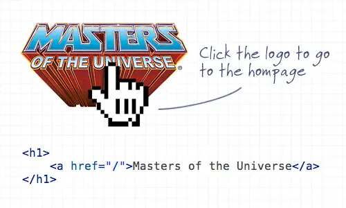
Linking the logo of a website to the homepage has become common practice and is now second nature for (most) web surfers to expect the logo to head back home. It’s also worth mentioning the logo should appear in the top left.
Crime 3: Not specifying a visited link state
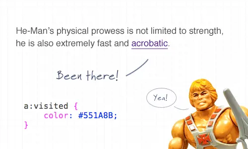
Visited link states do exactly as they say on the tin. It’s not the most advanced CSS selector, but it’s one that is often overlooked. Give users a visual clue as to which link has already been clicked.
Crime 4: Not indicating an active form field
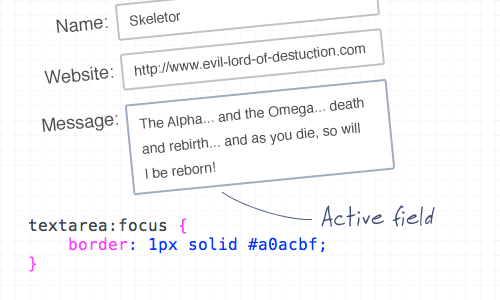
You can use the ‘:focus’ selector on lots of elements, but it’s super handy when used on inputs and textareas to indicate that the field is active. Add CSS styling such as a highlighted border, or a subtle change to the background color.
Crime 5: An image without an alt description

This is straying a little into the realm of accessibility, but it’s still an important consideration! Remember to always add a descriptive alt attribute to your images, unless of course they are used for decorative purposes, then the ALT attribute can be left empty (but should still exist!). When using an image as a link, enter a description of where the link goes.
Crime 6: A background image without a background color
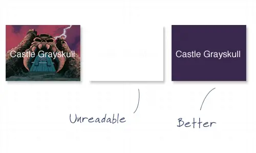
It’s common to use background images behind passages of text, but it’s worth remembering that if background images are disabled by the user, there needs to be a similar tone in the form of a background colour to avoid the text becoming unreadable.
Crime 7: Using long boring passages of content
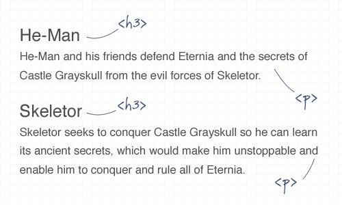
There’s nothing more off-putting than landing on a webpage that’s laid out as a continuous passage of text. Break up your content with images, headings and clear sections to make it easier to scan, read and digest.
Crime 8: Underlining stuff that isn’t a link
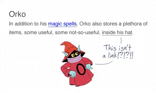
Everyone knows that text that’s underlined, or is a different colour is likely to be a link. Don’t go confusing people by throwing in underlined text elsewhere! To draw attention to a certain word, try using the strong or emphasize tags instead.
Crime 9: Telling people to click here
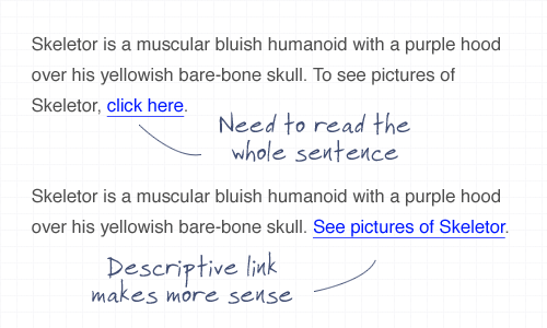
The words click here have been around since the dawn of the Internet, but have been shunned aside in favour of more usable options. Using the words click here requires the user to read the whole sentence to find out what’s going to happen. Instead, describe what’s going to happen in the actual anchor link text.
Crime 10: Using justified text

This is another tip that’s heading a little deeper into accessibility but is also an important point to consider. Justified text might look at neat and square to the eye, but it can generate some real readability problems, particularly for Dyslexic users who can find it troublesome to identify words due to the uneven spacing of justified paragraphs.
Author:
Chris Spooner
Chris Spooner is a designer who loves experimenting with new web design techniques collating creative website designs. Check out Chris’ design tutorials and articles at Blog.SpoonGraphics or follow his daily findings on Twitter.